
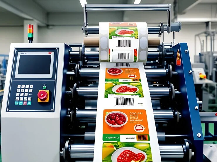
What Makes a Custom Label Design Eye-Catching Without Becoming Overcrowded?
Ever picked up a product just because the label made you stop mid-aisle, then put it right back down because it looked like a billboard crammed onto a two-inch sticker? That’s the fine line every brand walks, and getting it right is exactly what a custom label & sticker printing solution in Dubai is built for. Keep reading, because the next few minutes will show you how to grab attention without drowning your design in noise.
Understanding the Real Job of a Label
A label is a silent salesperson. It has roughly three seconds to communicate what a product is, why it matters, and why someone should trust it. That pressure is exactly why so many designs end up overloaded with text, icons, and colors fighting for the same space.
Overcrowding happens when every piece of brand information gets squeezed onto one surface out of fear that leaving something out means losing a sale. The result is visual noise where nothing stands out because everything is shouting at once.
Core Principles Behind Eye-Catching Labels
White Space Is Not Empty Space
Blank space around text and graphics isn’t wasted room; it’s what lets the eye rest and focus on what actually matters. A label with breathing room feels premium and easy to scan, while a packed one feels cheap and rushed.
Hierarchy Guides the Eye
Hierarchy means arranging elements so the most important detail, usually the brand name or flavor, is seen first, followed by supporting details in a clear order. Without hierarchy, a reader’s eye bounces around with no path to follow.
Color Restraint Speaks Louder
- Stick to two or three core colors so the palette feels intentional rather than accidental
- Use a single accent color to highlight one key detail, like “new” or “limited edition”
- Avoid gradients or clashing tones that compete with the product name for attention
Practical Design Moves That Keep Labels Clean
Typography That Doesn’t Compete With Itself
Pick one primary font for the brand name and a simple secondary font for details like ingredients or instructions. Mixing more than two font families almost always creates visual clutter that distracts from the product’s actual message.
Icons Over Paragraphs
Small icons for things like “vegan,” “sugar free,” or “eco packaging” communicate faster than a sentence ever could. They save space, add visual interest, and let shoppers absorb key facts in a single glance rather than reading fine print.
Sizing for the Right Surface
Design choices shift depending on format and scale, which is exactly why working with A4 sheet label suppliers in Dubai matters when a brand needs consistent proofing across bulk print runs before committing to a full production batch.
Testing Before You Commit
The Squint Test
Print a draft, hold it at arm’s length, and squint. If one element doesn’t jump out immediately, your hierarchy needs work. This simple trick mimics how a shopper glances at a shelf from a few feet away.
Get Outside Eyes On It
Show the design to someone unfamiliar with the brand and ask what they notice first. If their answer isn’t the thing you intended to highlight, the layout needs rebalancing before it goes anywhere near a print run.
Common Mistakes That Sneak In Unnoticed
Squeezing In Every Certification Badge
Not every certification needs equal visual weight on the front. Reserve the primary badges for the front label and move secondary ones to the back or side panel where curious buyers can still find them.
Ignoring Negative Space Around Text
Cramming text edge to edge without margin makes even short copy feel overwhelming. Give every line of text room to breathe, since tight spacing is one of the fastest ways to make a clean design look chaotic.
The bottom line
A label that grabs attention and still feels calm isn’t about doing more; it’s about knowing what to leave out. Whether you’re refining fonts, testing hierarchy, or sourcing materials through a custom label & sticker printing solution in Dubai, the goal stays the same: say less, show more, and let the design breathe.
FAQs
How many design elements are too many for one label?
There’s no fixed number, but if a shopper can’t identify the product and one key benefit within three seconds, the label likely has too many competing elements.
Should every product line share the same label template?
A shared template builds recognition, but small color or icon variations per flavor or size help shoppers tell products apart quickly without redesigning the entire layout from scratch.
Is a matte or glossy finish better for readability?
Matte finishes reduce glare and often read more clearly under bright store lighting, while glossy finishes can make colors pop but sometimes wash out text under strong light.
Can a minimal label still feel premium for budget brands?
Absolutely, minimal design often reads as premium regardless of price point, since clean layouts signal confidence and quality even when the product itself is positioned as affordable.
How often should a brand refresh its label design?
Most brands revisit label design every two to three years, or sooner if shelf feedback, sales data, or a rebrand suggests the current look no longer stands out.
Latest Posts
October 7, 2026
Have you ever...
October 7, 2026
Ever had a...

September 23, 2026
A thermal ribbon...

September 23, 2026
One misplaced label,...

September 7, 2026
A glass bottle...