How to Avoid Common Layout Errors in Brochure Printing Services
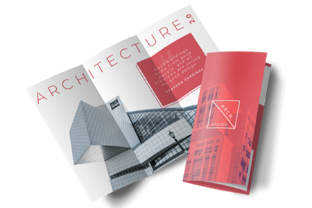
Even the best design loses its power when the layout goes wrong, and brochures are no exception. A brochure is a folded printed booklet that highlights your projects, services, or brand narrative. Do you know that over 60% of buyers say that they evaluate a company based on its printed materials? Therefore, avoiding layout flaws is crucial if you want to get the most out of brochure printing services in Dubai. Read this blog till the end to know how to avoid common layout mistakes in brochure printing, because even the smallest mistakes can completely change how customers perceive your brand.
Maintain a Consistent Margin
Any brochure that has uneven margins looks unprofessional. To prevent text from becoming too near the fold or cutting line, always ensure a safe margin space. This makes the finished print appear balanced and neat.
Verify the Bleed Area Again
Because the design doesn’t extend into the bleed, a lot of layout mistakes occur. After trimming, this results in white edges. To get a clean, edge-to-edge finish, extend backgrounds and pictures just a little bit over the cut lines.
Use High-Resolution Pictures
Blurry images instantly break the trust of your clients. Generally, anything with a DPI of less than 300 prints poorly. So make sure to choose clear images if your brochure highlights products or services.
Maintain Readable Fonts
Although stylish fonts are alluring, readability is compromised by an excessive number of styles or extremely tiny fonts. Choose no more than two or three clean, professional fonts.
Be Aware of Color Mismatches
Screen colors frequently print differently. Before printing the final version, convert your file to CMYK and check the proof. This keeps colors from being boring or too vibrant, which might damage the entire design.
Keep the Flow Logical
Your brochure should organically lead readers. Put the introduction, advantages, pictures, and main points in the correct sequence. Poor placement lowers engagement and confuses readers.
Don’t Overcrowd the Design
Brochures that include an excessive amount of information or photos appear messy. Give your content some breathing room by using white space. Readers are more engaged when the layout is tidy.
Select a High-Tech Printer
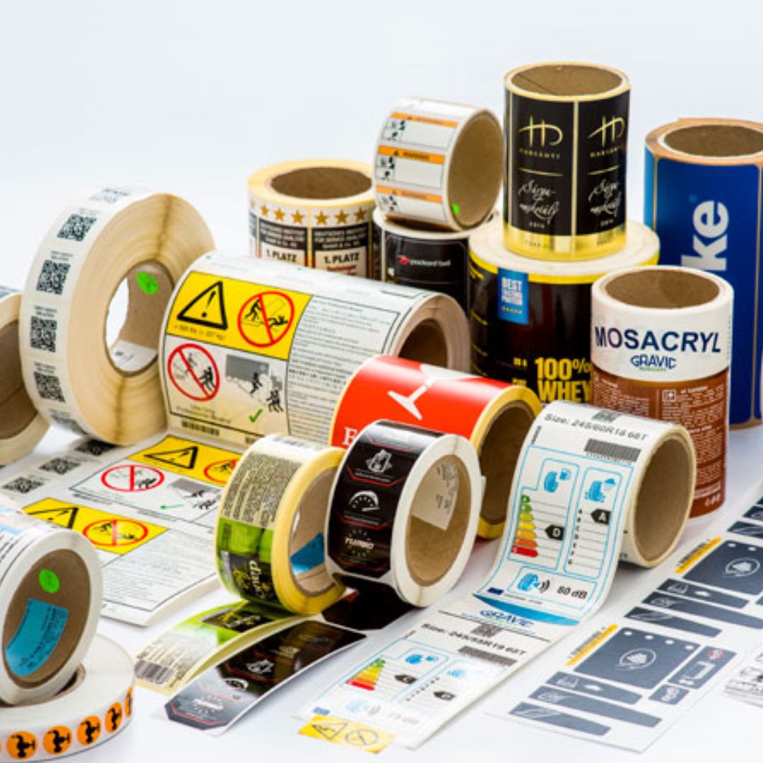
Accuracy is ensured by using reliable printing equipment. Because improved printing technology frequently translates into higher-quality brochures, many organizations also look into associated services like barcode ribbon manufacturers in the UAE or businesses known as the best label printers in Dubai.
Final takeaways
One of the simplest ways to enhance the quality of your brochures is to avoid layout mistakes. Use clear photos, CMYK colors, crisp fonts, and appropriate margins to greatly improve your printed content. Working with the best brochure printing services in Dubai results in a finished product that confidently and clearly reflects your business. Keep the above points in mind to make sure your next brochure will seem clean, convincing, and ready to impress.
Frequently Asked Questions
Why do brochure designs often go wrong?
Incorrect margins, missing bleed, low-resolution images, poor font selections, and color inconsistencies between the screen and print are the main causes of issues in brochures.
What is the significance of the bleed area when printing a brochure?
After cutting, the bleed eliminates unsightly white borders. A neat, polished finish is ensured by extending your design just a little bit over the cut line.
For brochures, what picture quality should I use?
Make use of photos with a minimum DPI of 300. Once printed, your brochure will remain sharp and professional with this high definition.
Why do brochure colors seem different in print?
Printers use CMYK, but screens use RGB. Before printing, convert your file to CMYK for a more precise color match.
How can I improve the readability of my brochure?
Avoid crowding and make use of balanced spacing, clear hierarchy, and clean fonts. These choices make it easier for readers to navigate your material.
Latest Posts
Copy ©2026 All Rights Reserved | Website Developed By Media Search Group


